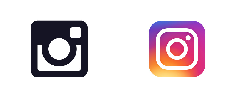
Love it or Hate it ... the New Instagram Logo is Here to Stay
It's been a week and a half since the new Instagram logo had dropped and so many people were in a frenzy about the new design. I personally love the new minimal look and feel. Instagram has 200 million daily active people — which is not total users, but the amount of people that come back to the app every single day, spends an average of 21 minutes on it. (Data provided by Instagram). I don’t know if I spend 21 minutes daily on it, but I do check it an obnoxious amount of times a day. They also updated their UI with a black & white minimal design approach letting the imagery shine and not letting it be hidden by all that blue color everywhere that the old UI had. Functionality wise this was definitely a must-have upgrade.
We realized we needed to move past a rendered camera to get a flexible, scalable glyph, but the previous glyph proved to be a weak basis for an icon. To maintain the previous icon’s gravity, we had to figure out how to give the new mark more character while also removing what was unnecessary. The question then became, how far do we go? If you abstract too much, the glyph doesn’t feel tied to the history and soul of Instagram. If you make it too literal, it’s hard to justify changing from what we currently have. After a lot of refinement, we landed on a glyph that still suggests a camera, but also sets the groundwork for years to come.
-Ian Spalter, Head of Design at Instagram, on Medium
OLD GLYPH VS. NEW GLYPH
Check out their new brand video below introducing the new logo.
Overall, we knew they would have to re-vamp their logo one day and I think it was a smart move. The camera element is still there with it's friendly, gradient and minimal line design. Now if you'll excuse me, let me get back on to see what people are doing in their lives that I'm not.
Enjoy! -xo Mel


